


Blog Categories
- Tips and Advice (55)
- Sustainability (26)
- Trends and Innovations (25)
- Tutorials and Templates (6)
- Regulations (2)
Nov
29
Posted on November 30, 2016 by Ash Bennett


29
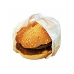
Is your Burger Insta Worthy?
Posted on November 30, 2016 by Ash Bennett
Is your Burger Insta Worthy?
You work hard. You have fine turned your recipes, sourced the best ingredients; invested time, capital and expertise. The consumer will appreciate all of your efforts. They will. But before that… Before that very first mouthful, the first sip, even the smell, the eyes have already gone ahead. It’s as if the eyes take the first bite and decide whether or not they want to take more. Presentation. I’ts more than functionality, more than just a way to transport and protect. Not only does your packaging says something about your product, it says something about the customer. Are they healthy, classy, ethical, extravagant. What does your product say about them? What does it say about you?
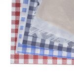
Perhaps it’s Tumbler and Instagram that we have to thank, but once again beauty is making headway when it comes to packaging design. Gone, are the brassy logos, the obvious ploys and slogans. Graphic Designers are breathing a sigh of relief, as at last they get the freedom to really be creative and they are coming up with some irresistible new looks to match your great food.
Which of these new trends would be you?
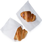
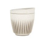
1. Purity
You know your product is good. There is no need to show off. Harken back to the days when Coco Chanel, stripped away the flounce and founded her classic style. Your design is simple, but not stark or cold. The tones are natural. Or perfect white. One or two colours; three at the most. Your choice of colour, whether bright or muted is fearless, but always tasteful. You just have the confidence to say this what I do. Your logo; or a crisp mark or a simple piece of alluring typography on quality card or label stock. This design of understated class will stand out against all others.
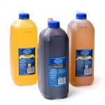
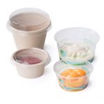
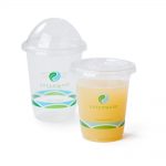
Purity is Perfect For: Pate. Sustainable produce. Heath food. White wine. Tea. Juice. Ice cream. Honey. Olive oil. Chocolate. Cold pressed coffee.
2. Geometric
You took risks and created something special. Give your customers a taste of your distinctive style with this new wave of package design. Geometric shapes are stretching themselves inside and out. A stark white box. Open the lid, blink your eyes and a thousand pastel diamonds dance, petal shaped. Think mandalas. Marks; faceted and unusual. The colours palate is reckless, ranging from bold primarys’ to pastel; even well placed neons’. There is such extravagance, but it’s always tasteful with a generous amount solid space, conscious to not to overload. Customers are responding. They are ready to try new foods, or twists upon the old. Capture this spirit. Give your designers’ the opportunity to play and give you packaging, that is inspired mixture of ingenuity and good taste.
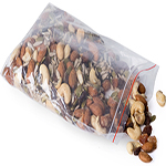
Geometric is Perfect For: Prepared meals. Jams. Gelato. Yoghurt. Anything sweet. Spirits. Red wine. Pasta. Donuts. Relish Herb tea.
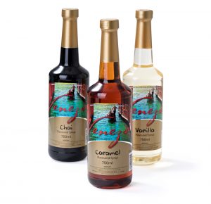
3. Beyond Vintage
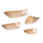
While most of the world is speeding up, some of you are taking one long breath, flexing your muscles and taking the time to make a good product that warrants a look that is serious, carved, beyond traditional, moving into a space that says, I last. Your packaging looks back to a time when design was absolutely sure of itself. Not needing to muck around with trends, the look was a legacy in itself. You can make it simple; a word, a mark, a wood cut-stamp. Be brave and without shame, unafraid to embellish or use metallic foiling or use natural fibres. This design speaks of heritage, expecting to last. It conveys quality. Yet there is humour. A clever graphic. A tag line that captures both your attitude and your exceptional product.
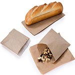
Beyond Vintage is Perfect For: Craft beer. Vinegar. Artisan bread. Cider. Cheese. Drinking Chocolate. Nut butters. Small goods. Coffee.