


Blog Categories
- Tips and Advice (55)
- Sustainability (26)
- Trends and Innovations (25)
- Tutorials and Templates (6)
- Regulations (2)
Jul
12
Posted on September 21, 2016 by Ash Bennett


12
3 Tips for Café Signage
Posted on September 21, 2016 by Ash Bennett
There are several key rules to observe when it comes to café signage. For example, be careful with punctuation; grammar enthusiasts will shame you for a misplaced apostrophe. And mind your typography; font sizing and spacing can be the difference between a ‘special’ on ‘brownies’ and ‘special brownies’.
Such considerations are important, but they fall under these three more general tips to keep in mind as you prepare your café signage.
1. Consider your customers
Who do you want to attract to your café? The way you present your business should reflect the market you want to reach. If your target is inner-city artists calling on the coffee muse, advertise with vibrant colours and hand-drawn menu boards. If you want to pull in businesspeople, aim for a professional style—monochromatic colouring, a simple font, and a streamlined design.
As in all things, listen to what your customers want. Signage is a means to speak directly to them, and they’ll speak back through their reactions. Notice what your customers like, what they respond to, and who they are. Think about the buildings that surround your business — who lives or works near you, and therefore who is most likely to pass your signage regularly. A sign is a form of visual merchandising, and you can chart its success by noting whom it attracts and why.
2. Consider your message
In thinking about your customers, think about what you’re saying to them. What should your sign tell people about your café? As one of the first and most immediate ways you communicate to customers, signage is a huge part of your branding.
Whether you intend it or not, your business has its own theme and personality. The food and drinks you produce, the service you give, the atmosphere you create, the people you draw in — these are all part of the experience your café offers. The design and advertising decisions you make — signage included — contribute to this experience, so inject personality into them.
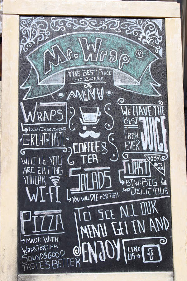
For example, many cafés put a blackboard in front of their door and update it daily with illustrations, quotations or memes. These might seem trite, but they succeed in giving a café character.
3. Consider the practicalities
The materials, lighting and size of your sign all play an important part in its look. There are many types of signage, and you should consider the range available so you can make the choice best suited to your business.
Digital signage, for instance, is increasingly popular. As well as looking sleek, the digital format makes it easier to update information and change appearance, so many cafés and restaurants use this platform to display their menus.
If you prefer a more personal approach, hanging signs remain popular.
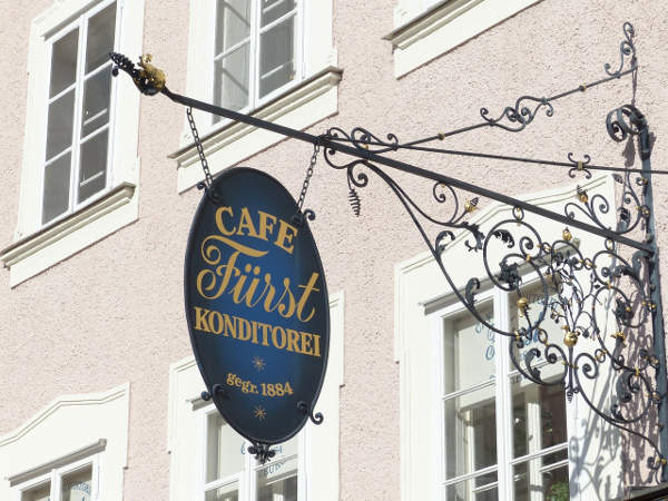
By extending from the front of a building, they also catch the eye. This style of signage is particularly popular in cities, where every business needs to stand out in a long line of neighbours. Melbourne’s famous laneways, for example, are crowded with hanging signs that advertise their cafés to customers approaching from up the street.
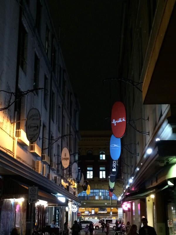
The downside of crowding is that it increases competition, with many signs of a similar size jostling for space.
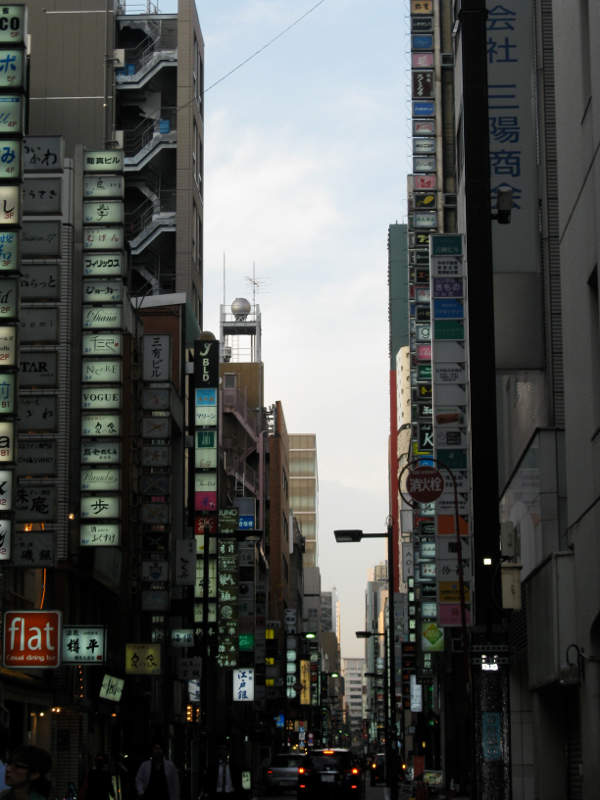
This is where a good design will serve you well: make your sign distinctive. Consider the many materials available, from wooden boards to neon lettering. Choose your typeface, colour scheme and logo with the aim of standing out from the crowd.
As well as materials, consider other practicalities. The following tips may seem like common sense, but it’s surprising how often they’re overlooked:
Keep up maintenance
If your sign looks old and worn, it makes your business seem tired. If your sign gets damaged, or the lighting fails, fix it immediately. Customers will notice a broken, flickering or neglected sign, and it will tell them that the owners don’t pay attention to their business — which won’t make those customers optimistic about the service.
Keep things fresh
Update your signage regularly. Consider giving your front sign a design overhaul or new coat of paint. If you have temporary signs around your café — such as a-frames, blackboards, banners, posters, or menus — change these over every few days or weeks. Customers will be aware of change, whether consciously or unconsciously, and it will keep your café feeling new instead of static.
Keep things clear
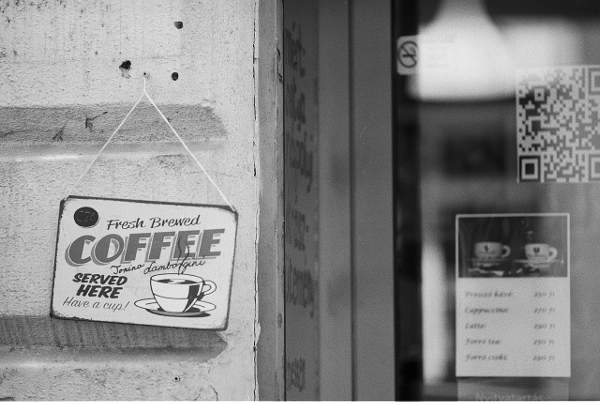
Signs let customers read your business at a glance and learn what you can offer them, so keep your message straightforward. Ensure your front sign or window advertises the food or drink you offer. A parched potential customer will hone in on a sign that says ‘coffee’ or ‘tea’. A hungry customer will look for a sign that promises lunch — ‘bakery’, ‘restaurant’, ‘charcuterie’, ‘patisserie’.
Dietary requirements are a major factor in helping customers choose where they eat. Your menus will indicate whether your food includes, for example, gluten-free and vegetarian options — but think beyond the small print. If you’re a vegan café, for example, your ingredients are part of your branding, so you should advertise your vegan status on your sign.
Also keep things clear in a more literal sense, by making sure your front sign is large enough to read from a distance and not crammed with information. A small and delicate design may be elegant up close, but it won’t grab interest from afar.
Signage may seem like an inconvenience — a necessary expense in letting people know where you are and what you sell. But keep in mind the above tips, and you’ll turn your café’s signage into one of its defining strengths.